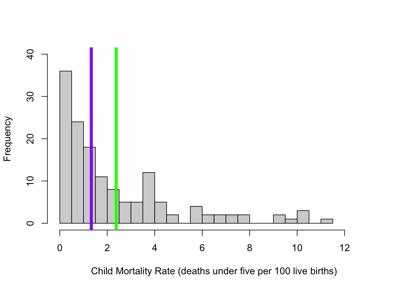
d <-read.csv("~/Dropbox/!WHY STATS/Chapter Datasets/Our World in Happy Data/DATASET_happy_data.csv", stringsAsFactors = T)hist(d$Child.Mortality, breaks =20, xlim =c(0,13), ylim =c(0,40), main ="",xlab ="Child Mortality Rate (deaths under five per 100 live births)")abline(v =mean(d$Child.Mortality, na.rm = T), lwd =5, col ="green")abline(v =median(d$Child.Mortality, na.rm = T), lwd =5, col ="purple")
The Brain Exam : More Practice?
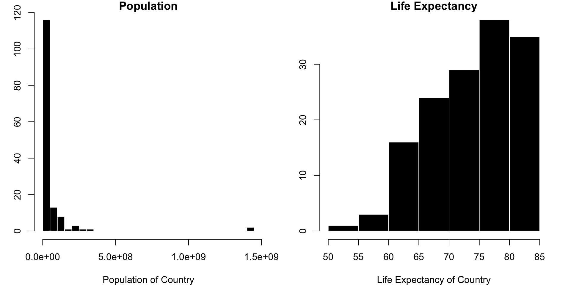
par(mfrow =c(1,2), cex =1, mar =c(4,3,1,2))hist(d$Population, col ="black", bor ="White", main ="Population", breaks =40, xlab ="Population of Country")hist(d$LifeExpectancy, col ="black", bor ="White", main ="Life Expectancy", xlab ="Life Expectancy of Country")
The Brain Exam.
I’ll show you a graph and some questions
Answer the questions.
NO R / NO INTERNET / AI TOOLS - JUST YOUR OWN BRAIN.
Can get 50% of any lost points back when I post the key.
Ready?
The Linear Model : Prediction is a Line
RECAP : The Mean as a Model (with Error)
RECAP : The Mean as Prediction?
\(\huge y_i = \hat{Y} + \epsilon_i\)
\(\Large y_i\) = the DV = the individual’s actual score we are trying to predict.
on the graph: each individual dot
\(\Large \hat{Y}\) = our prediction (the mean).
on the graph: the solid red line
\(\Large \epsilon\) = residual error = difference between predicted and actual values of y
on the graph: the distance between each dot and the line.
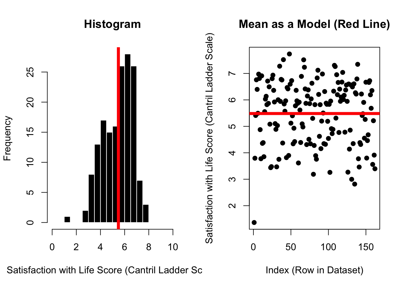
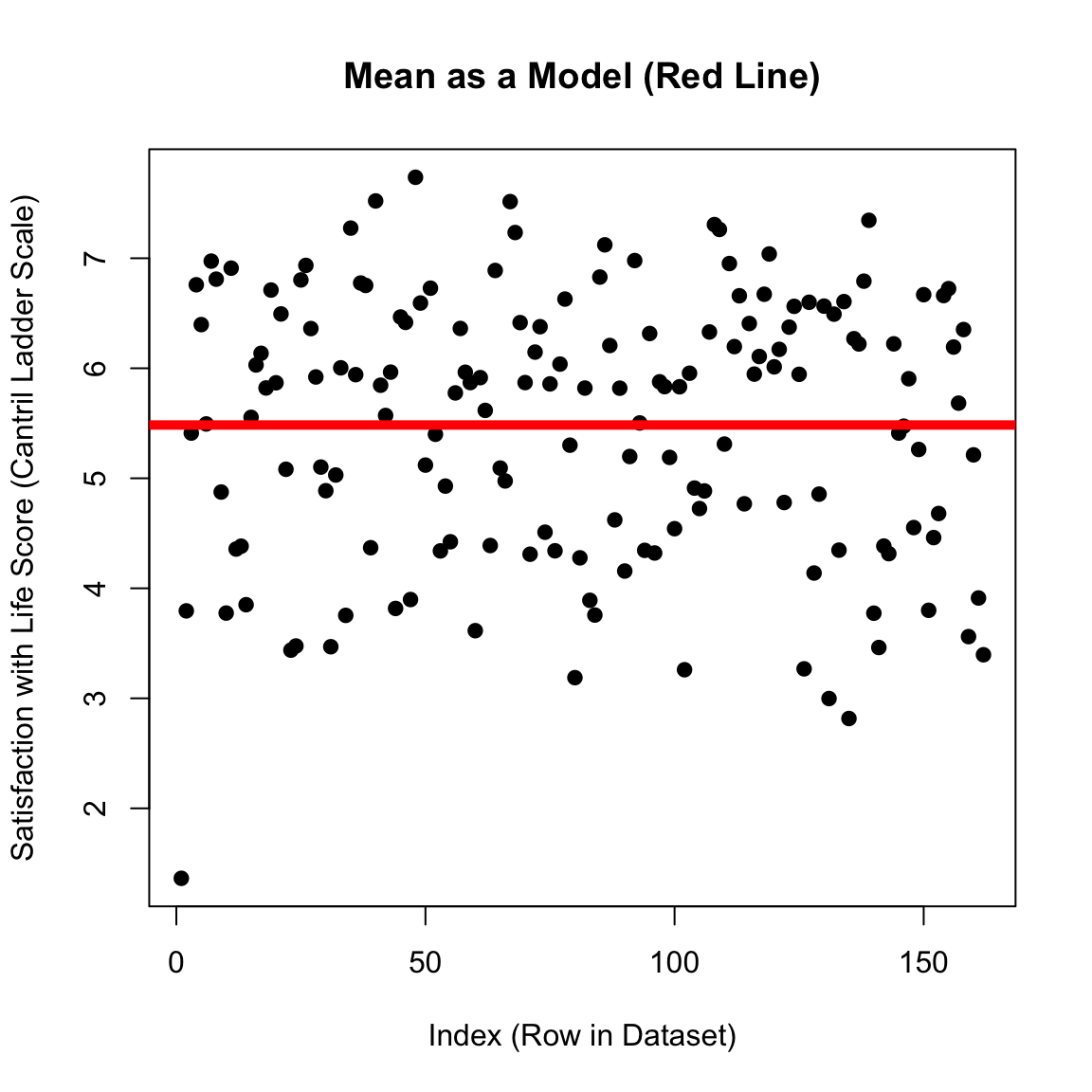
plot(d$SWLS_24, main ="Mean as a Model (Red Line)",pch =19,xlab ="Index (Row in Dataset)",ylab ="Satisfaction with Life Score (Cantril Ladder Scale)")abline(h =mean(d$SWLS_24, na.rm = T), lwd =5, col ='red')
This number is critical - quantified error in our prediction.
This number makes no sense (total unsquared error??!?!)
sd gives some context (average error)
use number as a starting place to see if we can make better predictions
plot(d$SWLS_24, main ="Mean as a Model (Red Line)",pch =19,xlab ="Index (Row in Dataset)",ylab ="Satisfaction with Life Score (Cantril Ladder Scale)")abline(h =mean(d$SWLS_24, na.rm = T), lwd =5, col ='red')
KEY IDEA : The mean is an okay starting place for our predictions, but we can try to do better!
Length of a Romantic Relationship ~ ______ + _____ + _______ + ….. + ______ + error
DISCUSS : Making Predictions
how would the variables (below) help (or not) predict country happiness in 2024?
what other variables might be important to include in the data?
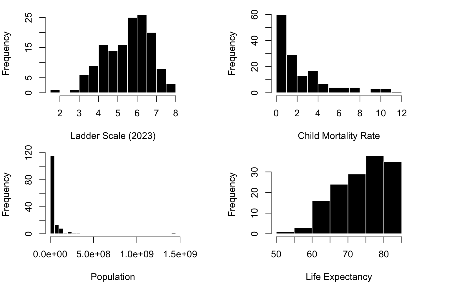
par(mfrow =c(2,2), cex =1, mar =c(4,4,1,4))hist(d$SWLS_23, col ="black", bor ="White", xlab ="Ladder Scale (2023)", main ="")hist(d$Child.Mortality, col ="black", bor ="White", xlab ="Child Mortality Rate", main ="")hist(d$Population, col ="black", bor ="White", xlab ="Population", breaks =40, main ="")hist(d$LifeExpectancy, col ="black", bor ="White", xlab ="Life Expectancy", main ="")
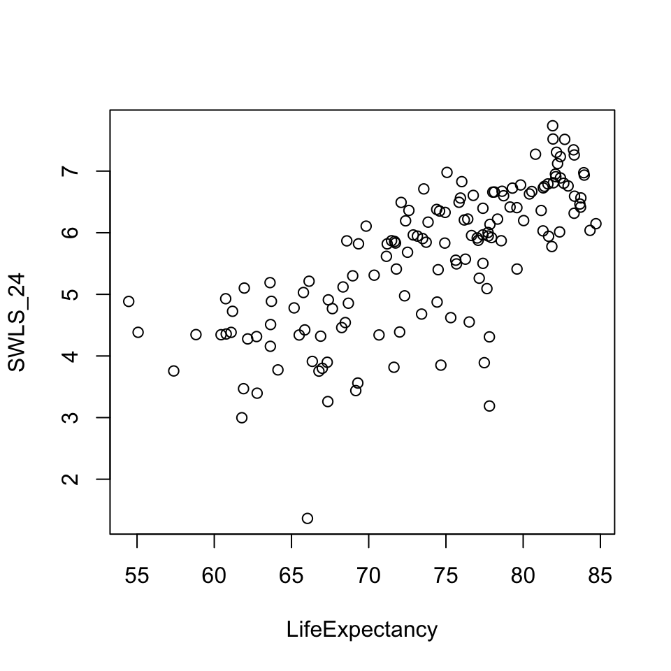
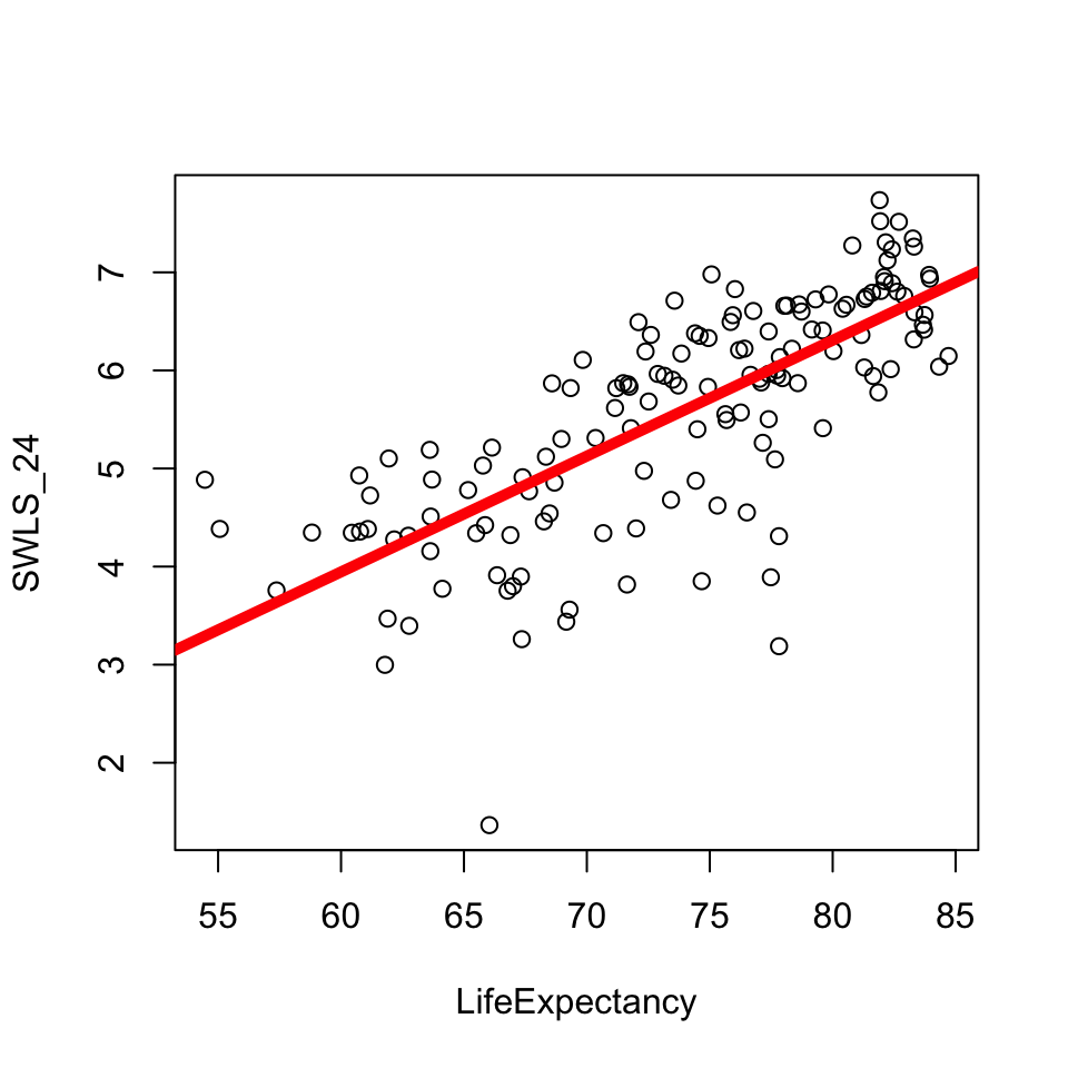
mod <-lm(SWLS_24 ~ LifeExpectancy, data = d) # defines the model; saves as modplot(SWLS_24 ~ LifeExpectancy, data = d) # graphs the relationship.abline(mod, lwd =5, col ='red') # draws a red line of width five based on mod
What’s Going On : It’s a Line
\(\Huge y_i = a + b_1 * X_i + \epsilon_i\)
round(coef(mod), 2)
   (Intercept) LifeExpectancy
         -3.14           0.12
mod <-lm(SWLS_24 ~ LifeExpectancy, data = d) plot(SWLS_24 ~ LifeExpectancy, data = d) abline(mod, lwd =5, col ='red')
\(\Large y_i\) = the DV = each actual score on the DV.
on the graph:** each dot on the y-axis
\(\Large a\) = the intercept = starting place for our prediction (“the predicted value of y when all x values are zero”.)
on the graph:** the value of the line at X = 0
\(\Large X_i\) = the IV = the actual score on the IV.
on the graph: the value of each dot on the x-axis
\(\Large b_1\) = the slope = an adjustment to our prediction of y based changes in x
on the graph: how much the line increases in y value when x-values increase by 1 unit.
\(\Large \epsilon_i\) = residual error = the distance between actual y and predicted y
on the graph: the distance between each individual data point and the line.
The Linear Model : Error
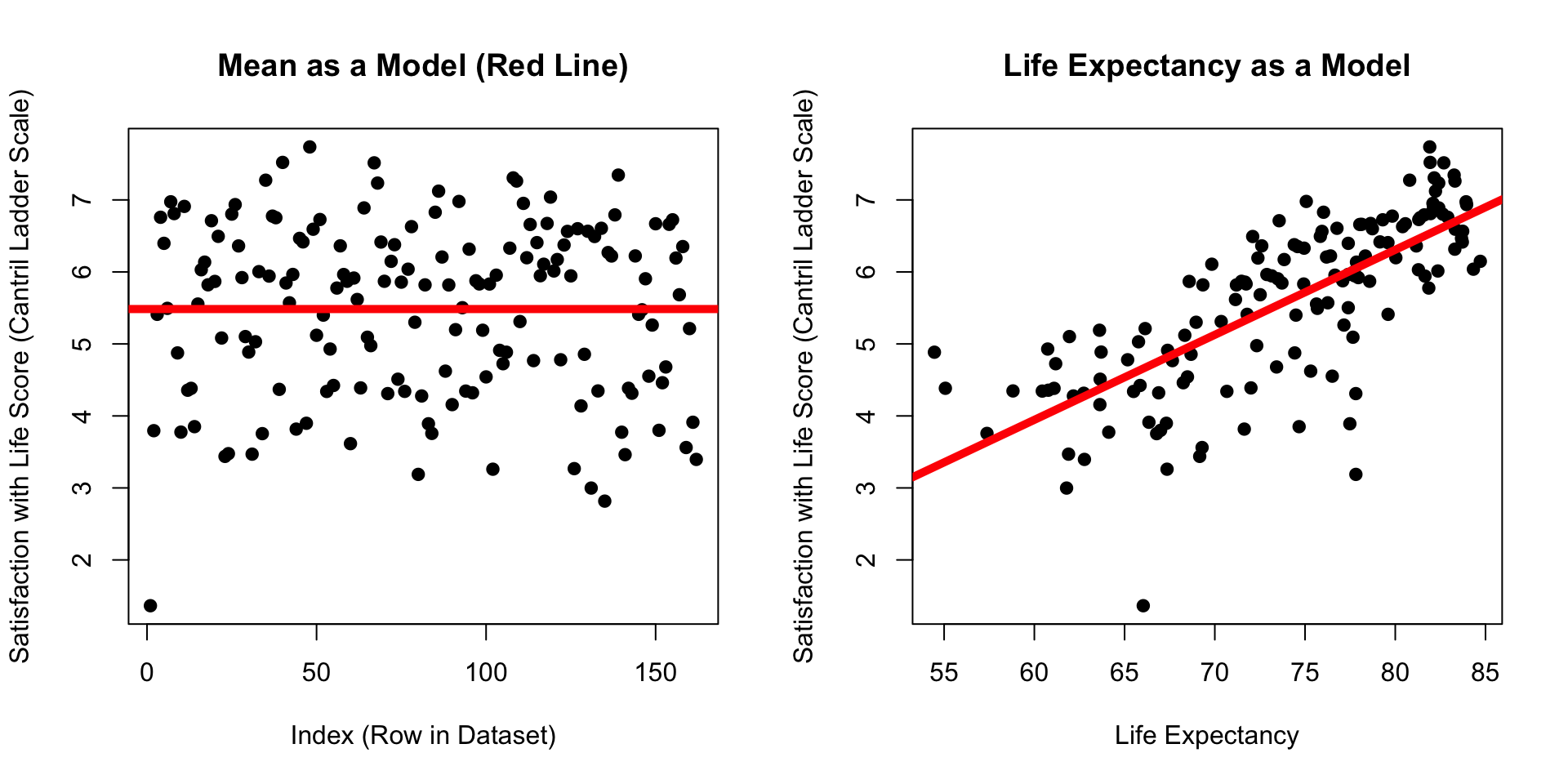
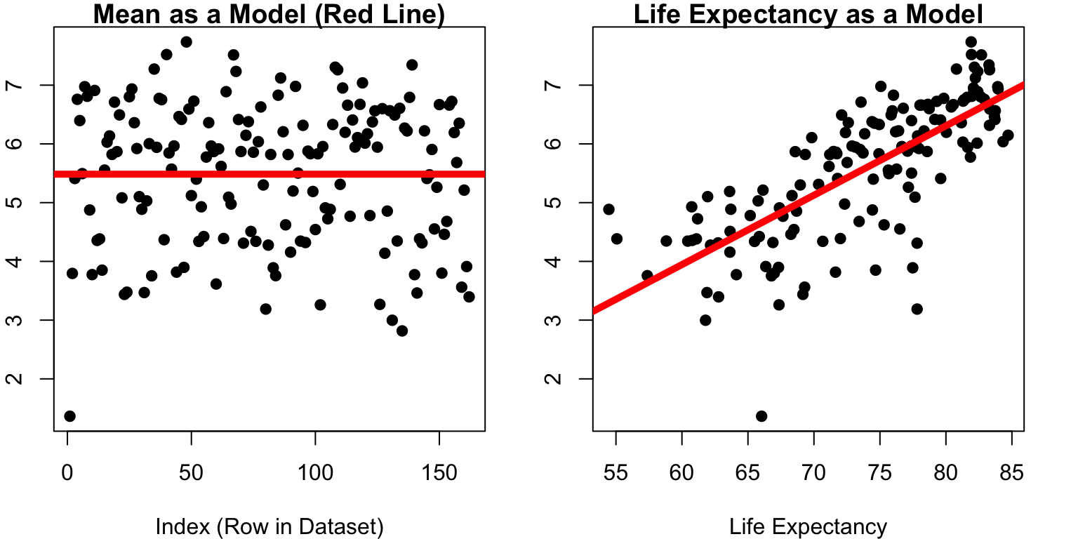
Which model has dots that are closer to the line?
par(mfrow =c(1,2))plot(d$SWLS_24, main ="Mean as a Model (Red Line)",pch =19,xlab ="Index (Row in Dataset)",ylab ="Satisfaction with Life Score (Cantril Ladder Scale)")abline(h =mean(d$SWLS_24, na.rm = T), lwd =5, col ='red')plot(SWLS_24 ~ LifeExpectancy, data = d, pch =19, main ="Life Expectancy as a Model", ylab ="Satisfaction with Life Score (Cantril Ladder Scale)",xlab ="Life Expectancy") abline(mod, lwd =5, col ='red')
par(mfrow =c(1,2), cex =1, mar =c(4, 2, 1, 2))plot(d$SWLS_24, main ="Mean as a Model (Red Line)",pch =19,xlab ="Index (Row in Dataset)",ylab ="Satisfaction with Life Score")abline(h =mean(d$SWLS_24, na.rm = T), lwd =5, col ='red')plot(SWLS_24 ~ LifeExpectancy, data = d, pch =19, main ="Life Expectancy as a Model", ylab ="Satisfaction with Life Score",xlab ="Life Expectancy") abline(mod, lwd =5, col ='red')
SWLS24 <- mod$model$SWLS_24 # using data that also have life expectancyresidual <- SWLS24 -mean(SWLS24) # errorSST <-sum(residual^2, na.rm = T) # sum of squared errorsSST # total sum of squared errors
[1] 195.867
SSM <-sum(mod$residuals^2) # R saves the residuals for youSSM # hooray!
[1] 89.63457
par(mfrow =c(1,2), cex =1, mar =c(4, 2, 1, 2))plot(d$SWLS_24, main ="Mean as a Model (Red Line)",pch =19,xlab ="Index (Row in Dataset)",ylab ="Satisfaction with Life Score")abline(h =mean(d$SWLS_24, na.rm = T), lwd =5, col ='red')plot(SWLS_24 ~ LifeExpectancy, data = d, pch =19, main ="Life Expectancy as a Model", ylab ="Satisfaction with Life Score",xlab ="Life Expectancy") abline(mod, lwd =5, col ='red')