m <- read.csv("~/Dropbox/!WHY STATS/Professor Datasets/Conspiracy Beliefs/data.csv", stringsAsFactors = T)
plot(m$familysize[m$familysize < 24], ylab = "Family Size (# of Persons)")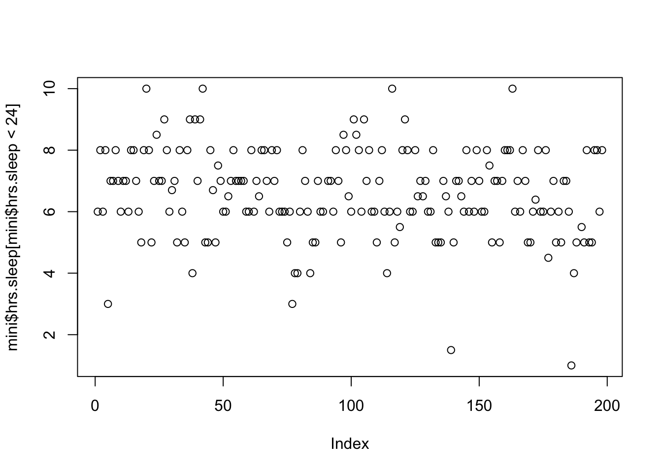
CHECK-IN : tinyurl.com/miniclassexit
Agenda
2:10 - 2:20. Check-In & Announcements.
2:20 - 3:40. Describing Data with Brain and R.
3:40 - 3:50. BREAK TIME
3:40 - 4:00. Milestone #2 (Intros)
4:00 - 5:00. Okay.


Where would a vertical line best fit through these data?
m <- read.csv("~/Dropbox/!WHY STATS/Professor Datasets/Conspiracy Beliefs/data.csv", stringsAsFactors = T)
plot(m$familysize[m$familysize < 24], ylab = "Family Size (# of Persons)")
plot(m$familysize[m$familysize < 24], ylab = "Family Size (# of Persons)")
abline(h = mean(m$familysize[m$familysize < 24], na.rm = T), col = 'red', lwd = 5)
The histogram organizes the data, but you can see the same patterns in both graphs.
par(mfrow = c(1,2))
plot(m$familysize[m$familysize < 24], ylab = "Family Size (# of Persons)")
abline(h = mean(m$familysize[m$familysize < 24], na.rm = T), col = 'red', lwd = 5)
hist(m$familysize[m$familysize < 24], ylab = "Family Size (# of Persons)", main = "")
abline(v = mean(m$familysize[m$familysize < 24], na.rm = T), col = 'red', lwd = 5)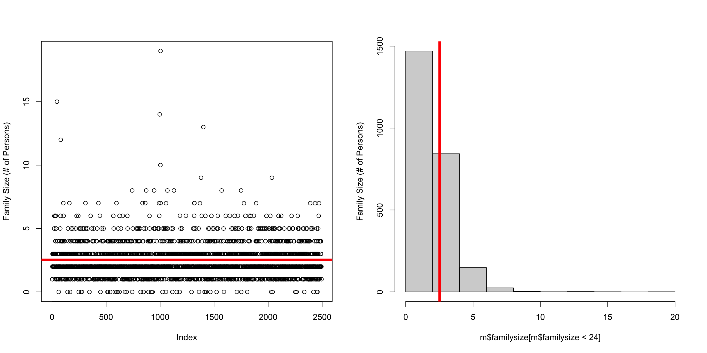
The mean family size in this dataset is :
mean(m$familysize[m$familysize < 24], na.rm = T)[1] 2.522053plot(m$familysize[m$familysize < 24], ylab = "Family Size (# of Persons)")
abline(h = mean(m$familysize[m$familysize < 24], na.rm = T), col = 'red', lwd = 5)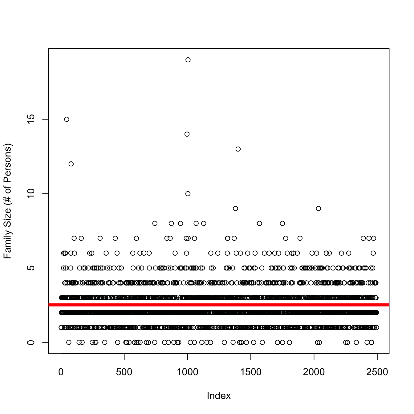
\[ \Huge y_i = \bar{Y} + \epsilon_i \]
hey, another check-in. tinyurl.com/interruptlifewithR
load the interruption data
name the dataset d to follow along with professor.
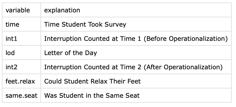
Download the “interruption” data from bCourses, and import this data into R. This dataset has two variables of the number of interruptions counted before (int1) and after (int2) our operationalization.

Looking at some literature reviews.
Refining our Linear Models.
Introducing the idea of a moderator variable